

 Get started
 How-to guides
 Reference
 Concepts
 Self-host gallery
 Appendix
Logo
The mark is three stacked rails. The wordmark is the mark plus the name in capitals.| Mark | Mark on dark | Wordmark (for dark) | Wordmark (for light) |
|---|---|---|---|
 |  |  |  |





Colors
Social images
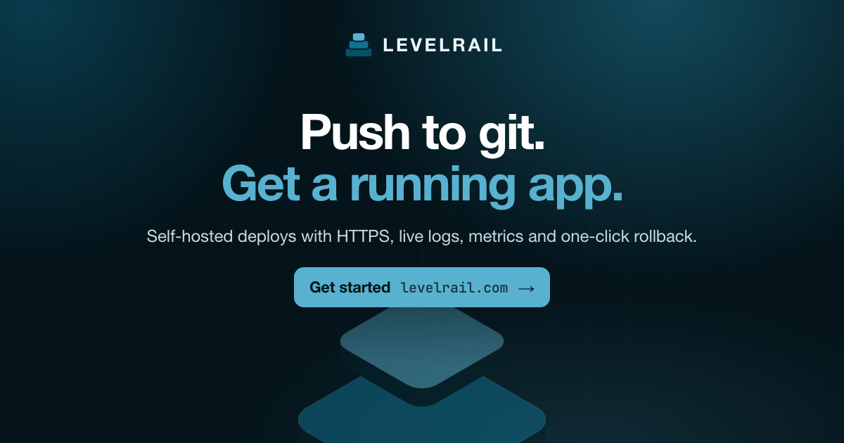
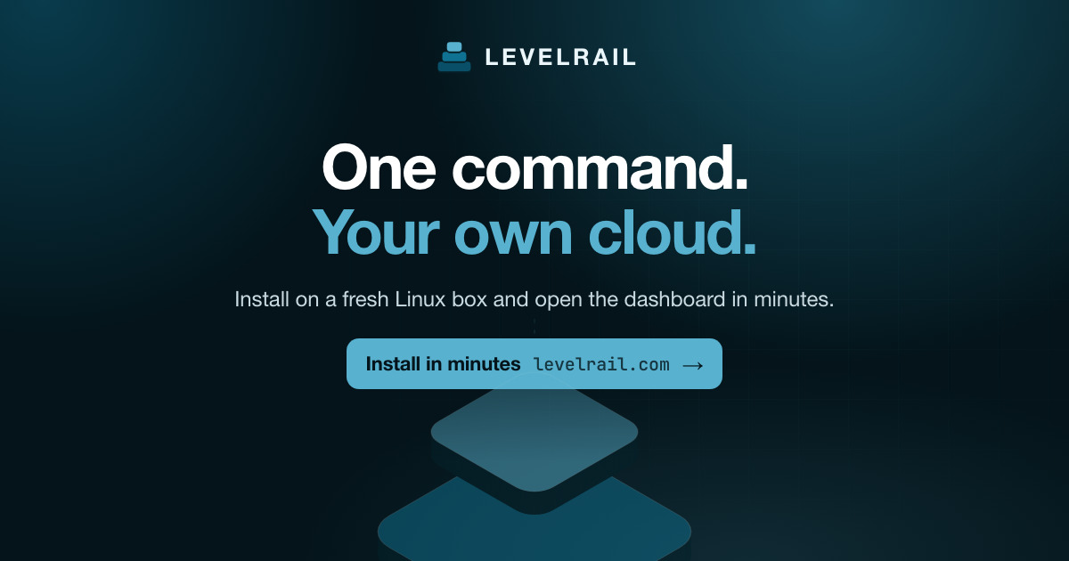
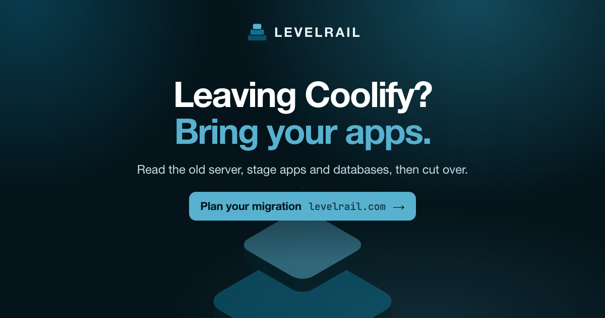
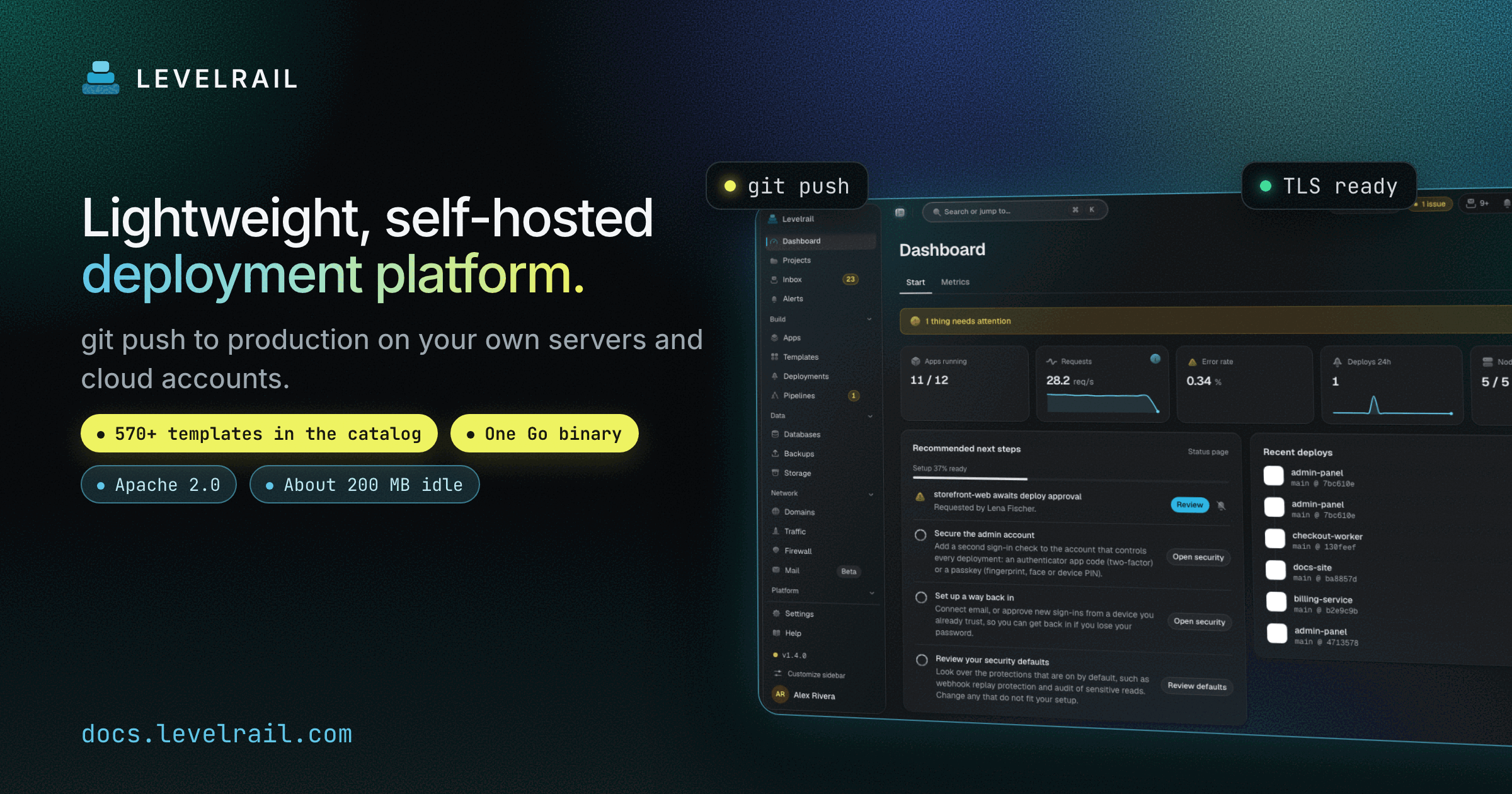
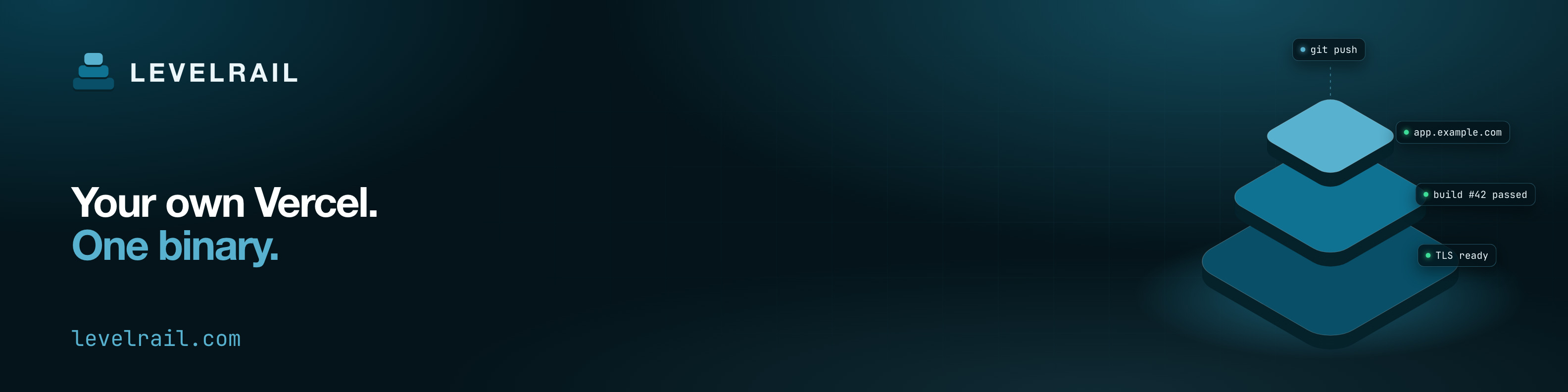
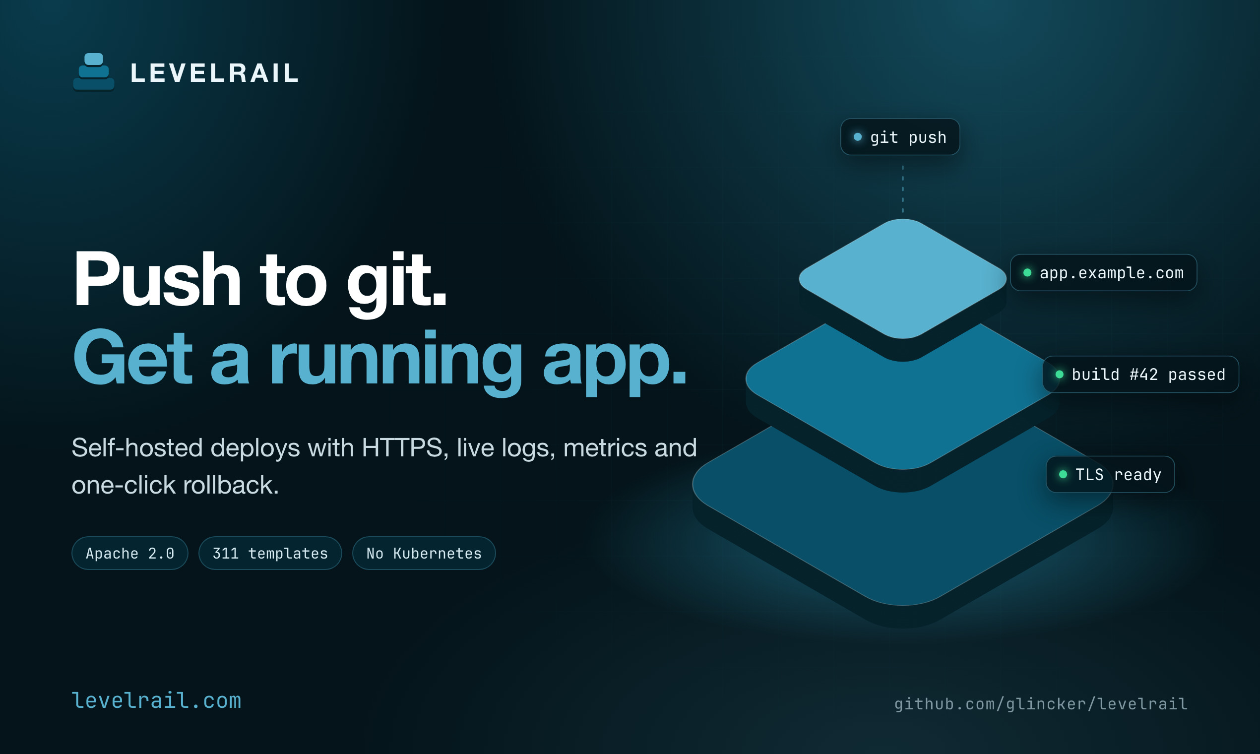
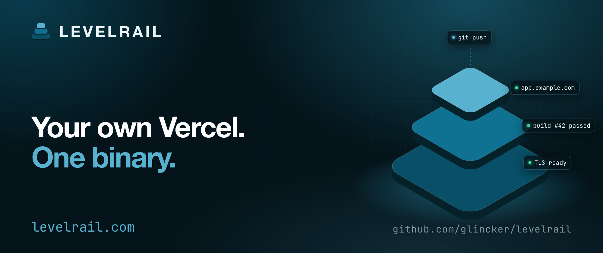
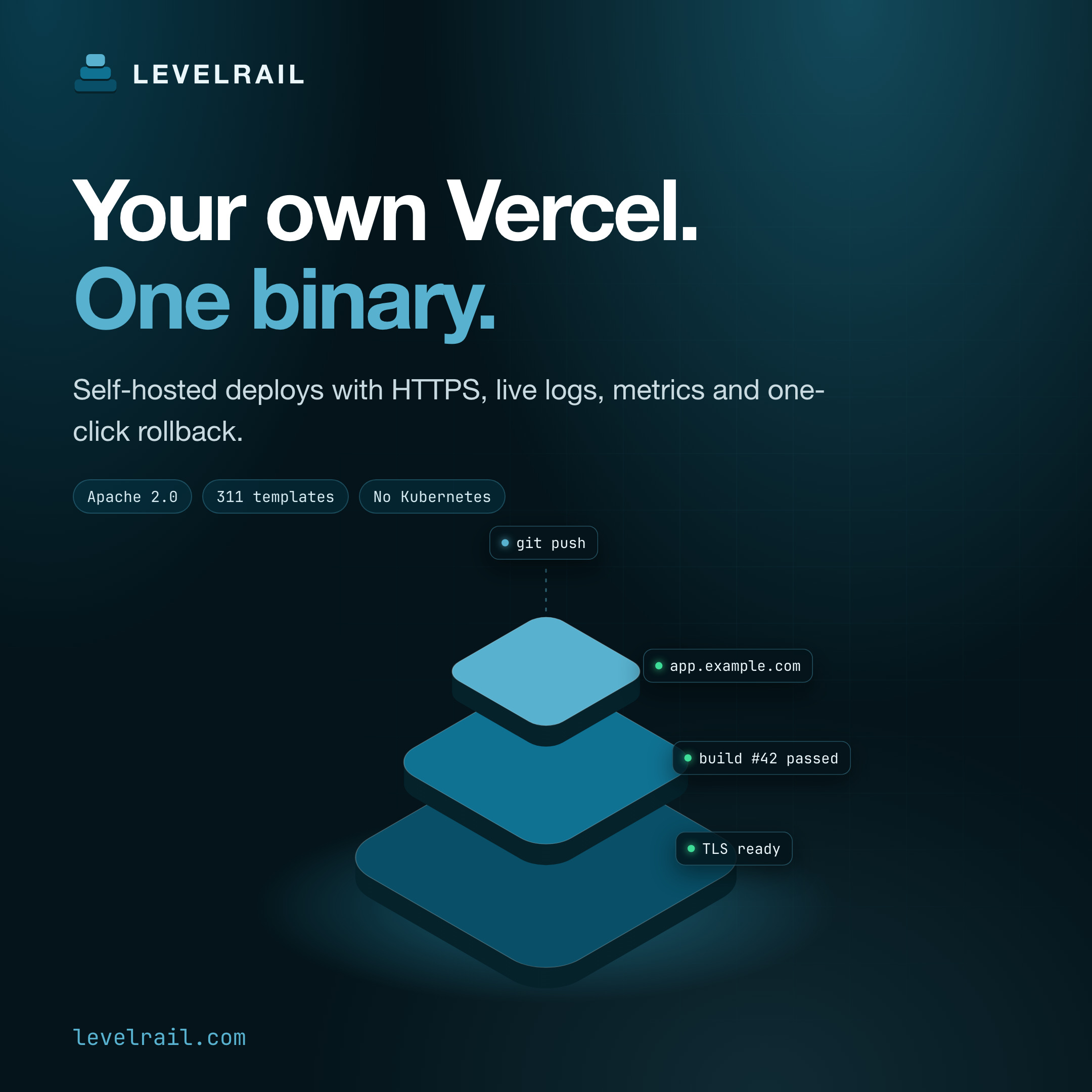
Link preview cards are 1200x630, the size most platforms expect. The platform banners below are rendered at 2x so they stay sharp on high density screens. The sizes listed are the logical size.Headlines
Pick the line that fits where you are posting.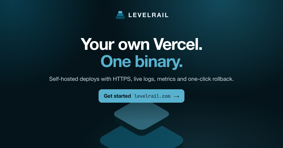
Sizes per platform
Badges
Two badges, each in four styles. Use the matched gradient pair on a README so each reader gets the version that fits their theme.- Small size: add
-smallbefore.svgfor a 32 px tall version (for exampledeployed-with-split-small.svg). - PNG fallback:
png/<name>@2x.png(80 px tall) for places that do not render SVG, such as some email clients and note apps. - Which one: the split works on any background. The gradient pair is for light and dark pages. The teal outline is the quietest.
- Rules: do not recolor, stretch, crop or rotate a badge, and keep it at least 32 px tall with some space around it.
- Alt text: use the badge text, for example
Deployed with Levelrail. Link it tohttps://levelrail.com.
One line to use
Levelrail is a self-hosted deploy platform in a single Go binary: push to git, get HTTPS, live logs, metrics and one-click rollback.Licensed under Apache 2.0. Source: github.com/glincker/levelrail.